Last Updated: 2023-09-24 15:30:59 Sunday
-- TOC --
Bar Chart主要用于可视化分类数据及其出现频次,每一个bar代表一个分类,其高度对应频率或相对频率(relative frequency,分类频率除以总统计次数)。注意区分bar chart和histogram,前者用于quanlitative数据,后者用于quantitative数据,还需要自己做区间分割。
简单的示例:
import matplotlib.pyplot as plt
cat = ('Apple', 'Banana', 'Orange', 'Peach', 'Melon')
num = (4, 16, 9, 3, 1)
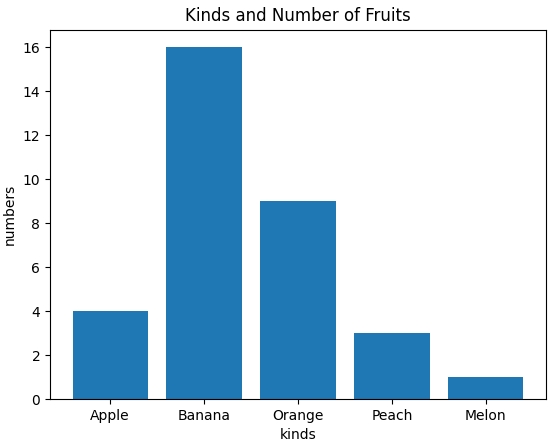
fig, ax = plt.subplots()
ax.set_title('Kinds and Number of Fruits')
ax.set_xlabel('kinds')
ax.set_ylabel('numbers')
ax.bar(cat, num)
plt.show()
效果图:
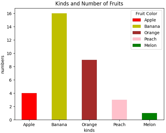
这个画面有些太单调朴素了,我们来加点颜色:
import matplotlib.pyplot as plt

cat = ('Apple', 'Banana', 'Orange', 'Peach', 'Melon')
num = (4, 16, 9, 3, 1)
fcolors = ('r', 'y', 'brown', 'pink', 'g')

fig, ax = plt.subplots()

ax.set_title('Kinds and Number of Fruits')
ax.set_xlabel('kinds')
ax.set_ylabel('numbers')
ax.bar(cat, num, width=0.5, color=fcolors, label=cat)
ax.legend(title='Fruit Color')

plt.show()
效果图:
我们继续增加一点元素:
import matplotlib.pyplot as plt

cat = ('Apple', 'Banana', 'Orange', 'Peach', 'Melon')
num = (4, 16, 9, 3, 1)
fcolors = ('r', 'y', 'brown', 'pink', 'g')

fig, ax = plt.subplots(figsize=(4.6,3.8))
#fig.set_figwidth(4.6)
#fig.set_figheight(3.8)
fig.subplots_adjust(right=0.7)

ax.set_title('Kinds and Number of Fruits')
ax.set_xlabel('kinds')
ax.set_ylabel('numbers')
bar = ax.bar(cat, num, width=0.5, color=fcolors, label=cat)
ax.legend(title='Fruit Color')

ax.bar_label(bar, fmt='[%d]', label_type='center')

plt.show()
效果图:
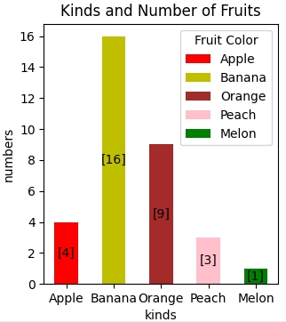
如果将bars按照从高到底的顺序排序后重新渲染,得到的bar chart还有一个名字,叫做Pareto Chart!
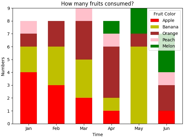
Stacked Bar Chart
这类bar chart非常常见,其实就是对同一组分类进行另一个维度的统计和展示,常见的就是时间维度。下面是一个示例代码,展示每个月各种水果的消耗情况:
import matplotlib.pyplot as plt

month = ('Jan', 'Feb', 'Mar', 'Apr', 'May', 'Jun')
consume = {'Apple': (4,3,2,1,0,1),
           'Banana': (2,3,3,1,6,0),
           'Orange': (1,2,3,4,1,2),
           'Peach': (1,0,1,1,0,1),
           'Melon': (0,0,0,1,2,3)}
fcolors = {'Apple': 'r',
           'Banana': 'y',
           'Orange': 'brown',
           'Peach': 'pink',
           'Melon': 'g'}

fig, ax = plt.subplots()
ax.set_title('How many fruits consumed?')
ax.set_xlabel('Time')
ax.set_ylabel('Numbers')

bottom = [0,0,0,0,0,0]
for name,num in consume.items():
    bar = ax.bar(month, num, width=0.6, color=fcolors[name], label=name, bottom=bottom)
    bottom = [bottom[i]+num[i] for i in range(len(month))]

ax.legend(title='Fruit Color')
plt.show()
效果图:
本文链接:https://cs.pynote.net/sf/python/matplotlib/202309232/
-- EOF --
-- MORE --