-- TOC --
Historgram与Bar Chart放在一起,虽然都是一根根的某种柱状图,但有很大的区别。Histogram用来绘制quantitative variable,需要将数据等距离分组,画出来的柱状图,柱之间没有间隔。
下面是一个简单的示例:
import matplotlib.pyplot as plt
import numpy as np
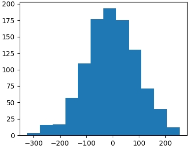
data = [np.random.randn()*100 for i in range(1000)]
fig, ax = plt.subplots()
ax.hist(data, bins=12)
plt.show()
A
binis a container that you keep or store things in. Abinis a container that you put waste or rubbish in.
bins=12表示将数据分成12段,效果图如下:
本文链接:https://cs.pynote.net/sf/python/matplotlib/202310023/
-- EOF --
-- MORE --